
Appearance
Product cards
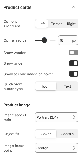
A product card is the tile that represents a product in any grid or carousel — collection pages, search results, best sellers, recommendations, recently viewed. These settings apply to all of them at once, so a product looks the same wherever a customer meets it.
Open Theme settings → Product cards in the theme editor.
Badges on the card are configured separately, under Product badges.
Images
Image aspect ratio sets the shape of every card image. This is what keeps a grid tidy: whatever mix of square, portrait and landscape photos your catalog contains, every card is cropped to the same shape, so rows line up.
Object fit decides how a photo fills that shape:
- Cover fills the card and crops whatever does not fit. Best for photography, and the default.
- Contain fits the whole image inside the card, leaving space around it. Better for cut-out product shots on a plain background, where cropping would clip the product.
Image focus point sets which part survives the crop when using Cover. It is a fallback — if you have set a focal point on the image itself in Shopify, that wins, so you can fix one awkward photo without changing the setting for every card.
Hover behavior
Show second image on hover swaps to the product's second photo when the cursor is over the card.
The theme decides what a card does based on how many images the product has:
| Product images | Card behavior |
|---|---|
| 1 | Static image |
| 2 | Swaps to the second image on hover |
| 3 or more | Becomes a small carousel with dots |
On touch devices there is no hover, so two-image products stay static and carousel cards are swiped.
Content
Content alignment positions the title, price and swatches — left, center or right. Left reads fastest in a dense grid; center suits sparser, more editorial layouts.
Show vendor adds the brand above the title. Useful for multi-brand stores, noise for single-brand ones.
Show price can be turned off for catalog-style stores that do not sell directly.
Quick view button type sets how the quick view control appears on the card, or you can leave quick view out of the card entirely. See Quick view.
Color swatches
Cards show color swatches automatically when a product has an option named Color (or Colour). Selecting one updates the card's image and price without leaving the grid.
The swatch itself comes from Shopify: set a color or an image on the option value under Products → Variants. Their shape is set by the swatch radius in Appearance.
| Setting | Type | Default | Notes |
|---|---|---|---|
| Content alignment | Dropdown | Left | Options: Left, Center, Right |
| Corner radius | Slider (0–40 px) | 18 | — |
| Show vendor | Checkbox | Off | — |
| Show price | Checkbox | On | — |
| Show second image on hover | Checkbox | On | — |
| Quick view button type | Dropdown | Icon | Options: Icon, Text |
Product image
| Setting | Type | Default | Notes |
|---|---|---|---|
| Image aspect ratio | Dropdown | Portrait (3:4) | Options: Adapt to image, Square (1:1), Portrait (3:4), Landscape (4:3) |
| Object fit | Dropdown | Cover | Options: Cover, Contain |
| Image focus point | Dropdown | Center | Options: Center, Top, Bottom, Left, Right |