
Appearance
Product badges
Badges are the small labels that sit over a product image — sale, sold out and new. They appear on product cards throughout the store.
Open Theme settings → Product badges in the theme editor.
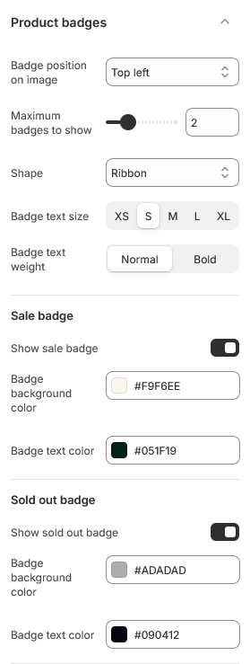
The three badges
Each has its own switch and its own two colors, so you can show only the ones you want and color each to suit.
| Badge | Shows when |
|---|---|
| Sale | The product has a compare-at price higher than its price |
| Sold out | The product is unavailable |
| New | The product is tagged new |
The sale and sold out badges are automatic — Shopify already knows those states, so there is nothing to maintain.
Tagging a product as new
The new badge is the one you control. Add the tag new to a product under Products → Tags in the admin, and remove it when the product is no longer new. Nothing expires it for you.
The tag is matched exactly, so new works and New Arrival does not.
Position and stacking
Badge position on image places badges in one corner of the image.
Maximum badges to show caps how many appear at once. A product can qualify for more than one — a new product on sale earns two — and past two or three they start covering the photograph they are meant to draw attention to. The default of 2 is a reasonable ceiling.
Appearance
Shape sets the badge outline. Badge text size and Badge text weight control the label.
Each badge then has its own Badge background color and Badge text color. These are set directly rather than coming from a color scheme, because a sale badge usually wants to stand apart from the section it sits in rather than blend into it.
Check the contrast
Badge colors are the one place in the theme where you can pick a combination the schemes would never produce — pale text on a pale background, for example. Preview a real product card after changing them rather than judging from the color picker.
| Setting | Type | Default | Notes |
|---|---|---|---|
| Badge position on image | Dropdown | Top left | Options: Top left, Top right, Bottom left, Bottom right |
| Maximum badges to show | Slider (1–3) | 2 | — |
| Shape | Dropdown | Ribbon | Options: Pill, Rounded, Square, Ribbon |
| Badge text size | Dropdown | S | Options: XS, S, M, L, XL |
| Badge text weight | Dropdown | Normal | Options: Normal, Bold |
Sale badge
| Setting | Type | Default | Notes |
|---|---|---|---|
| Show sale badge | Checkbox | On | — |
| Badge background color | Color | #F9F6EE | — |
| Badge text color | Color | #051F19 | — |
Sold out badge
| Setting | Type | Default | Notes |
|---|---|---|---|
| Show sold out badge | Checkbox | On | — |
| Badge background color | Color | #090412 | — |
| Badge text color | Color | #ffffff | — |
New badge
| Setting | Type | Default | Notes |
|---|---|---|---|
| Show new badge | Checkbox | On | — |
| Badge background color | Color | #008151 | — |
| Badge text color | Color | #FFFFFF | — |