
Appearance
Appearance
The settings that shape the layout itself — how wide the content sits, how much air is between sections, how rounded everything is, and how the theme animates. They apply everywhere, so this is the group that most defines how the store feels.
Open Theme settings → Appearance in the theme editor.
Layout
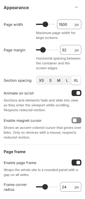
Page width is the maximum width the content stretches to on large screens. Full-width sections such as heroes ignore it and run edge to edge.
Page margin is the gap between the content and the edge of the screen. It matters most on phones, where it is the only thing stopping text from touching the bezel.
Section spacing sets the vertical rhythm between sections. It is a single choice rather than a number so the whole store stays consistent.
Grid gap is the space between items inside a grid — product cards in a collection, images in a gallery.
Page frame
Enable page frame insets the whole storefront slightly, so the page sits on the background like a card rather than filling the window. Frame corner radius rounds its corners.
The frame applies to templates that open with a hero — the home page and the inner pages that begin with a Page hero. On those pages the hero image bleeds up behind the announcement bar and header, which is what makes the effect read as intentional rather than as a stray margin.
Corner radius
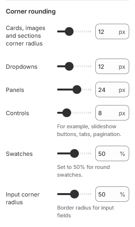
Six separate radius settings, each covering a family of elements:
| Setting | Applies to |
|---|---|
| Cards, images and sections corner radius | Product cards, images, section panels |
| Dropdowns | Menus and select dropdowns |
| Panels | Larger surfaces such as drawers and modals |
| Controls | Small controls and inputs |
| Swatches | Color swatches on product cards |
| Input corner radius | Form fields |
Swatches and inputs are set as a percentage, not pixels, so 50% gives a circle at any size. The rest are pixels.
Motion
Animate on scroll fades and lifts content into view as the visitor scrolls, and enables smooth scrolling.
Enable magnet cursor replaces the pointer with a small accent circle that grows over links. It is off by default. It has no effect on touch devices, which have no cursor to replace.
Durations
Four sliders — fast, base, slow and slower — set the speed of every transition in the theme. Individual effects pick whichever tier suits them, so changing one slider adjusts a whole class of animation at once rather than a single element.
Lower values feel snappier. Raising them all makes the store feel more deliberate, but past roughly double the defaults the interface starts to feel unresponsive rather than elegant.
| Setting | Type | Default | Notes |
|---|---|---|---|
| Page width | Slider (1000–2000 px) | 1500 | Maximum page width for large screens. |
| Page margin | Slider (15–80 px) | 32 | Horizontal spacing between the container and the screen edges |
| Section spacing | Dropdown | XL | Options: XS, S, M, L, XL |
| Animate on scroll | Checkbox | On | Sections and elements fade and slide into view as they enter the viewport while scrolling. Respects reduced-motion. |
| Enable magnet cursor | Checkbox | Off | Shows an accent-colored cursor that grows over links. Only on devices with a mouse; respects reduced-motion. |
Page frame
| Setting | Type | Default | Notes |
|---|---|---|---|
| Enable page frame | Checkbox | On | Wraps the whole site in a rounded panel with a gap on all sides. |
| Frame corner radius | Slider (0–60 px) | 24 | — |
Corner rounding
| Setting | Type | Default | Notes |
|---|---|---|---|
| Cards, images and sections corner radius | Slider (0–40 px) | 12 | — |
| Dropdowns | Slider (0–40 px) | 12 | — |
| Panels | Slider (0–40 px) | 24 | — |
| Controls | Slider (0–40 px) | 8 | For example, slideshow buttons, tabs, pagination. |
| Swatches | Slider (0–100 %) | 50 | Set to 50% for round swatches. |
| Input corner radius | Slider (0–100 %) | 50 | Border radius for input fields |
Grids
| Setting | Type | Default | Notes |
|---|---|---|---|
| Grid gap | Slider (12–48 px) | 32 | — |
Animation
| Setting | Type | Default | Notes |
|---|---|---|---|
| Fast duration | Slider (100–300 ms) | 250 | — |
| Base duration | Slider (300–500 ms) | 400 | — |
| Slow duration | Slider (500–800 ms) | 600 | — |
| Slower duration | Slider (800–1200 ms) | 800 | — |