
Appearance
Newsletter banner
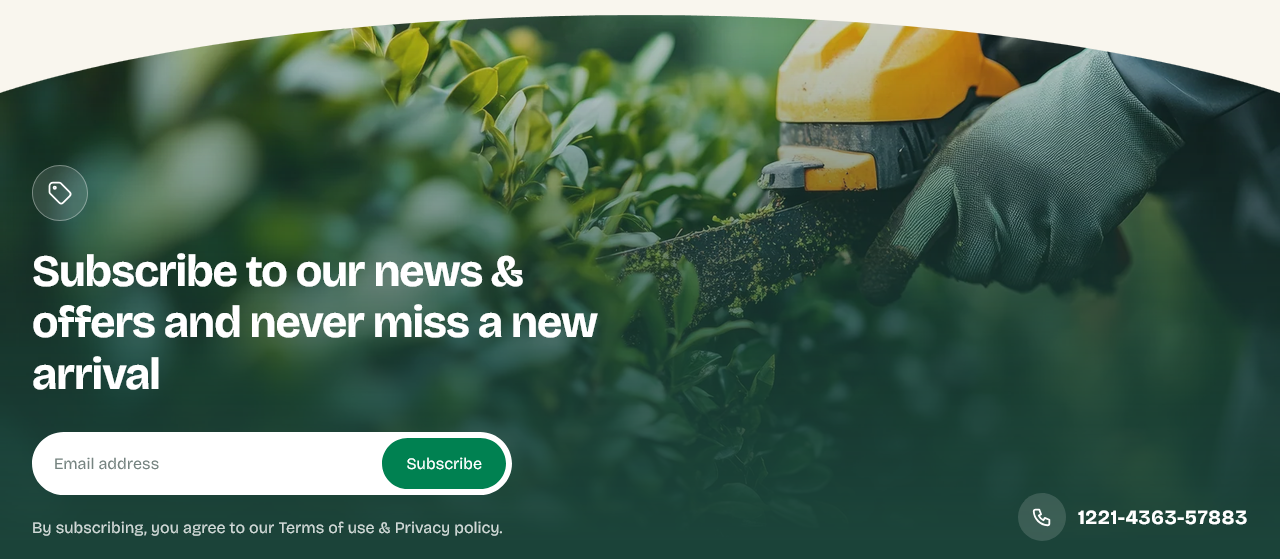
A full-width signup band over a background image. The in-page counterpart to the Newsletter popup — it asks rather than interrupts.
Setting it up
Heading, Email input placeholder, Button label and Disclaimer cover the form. Background image sits behind it.
Show tag icon adds a small icon beside the heading.
Show top curve curves the edge where this section meets the one above.
Phone number
Show phone number and Phone number put a number beside the form, for customers who would rather talk than type.
Only show a number somebody answers. An unanswered line costs more goodwill than not offering one.
The disclaimer
Say what people are signing up to and link to your privacy policy. It is required in some markets, and it raises signups everywhere — the specific promise of "one email a month" converts better than an unqualified "subscribe".
Where the addresses go
Into your Shopify customer list with marketing consent, under Customers in the admin. Nothing is sent automatically; connect Shopify Email or another app to send to the list.
Popup or banner
Both is usually one too many. The popup catches more addresses and costs more goodwill; the banner catches fewer and annoys nobody.
If you run both, at least keep the wording different — being asked the same thing twice on one page reads as carelessness.
Settings
Section settings
Content
| Setting | Type | Default | Notes |
|---|---|---|---|
| Show tag icon | Checkbox | On | — |
| Heading | Text | Subscribe to our news & offers and save 10% on your first… | — |
| Email input placeholder | Text | Email address | — |
| Button label | Text | Subscribe | — |
| Disclaimer | Rich text | <p>By subscribing, you agree to our Terms of use & Privac… | — |
Contact
| Setting | Type | Default | Notes |
|---|---|---|---|
| Show phone number | Checkbox | On | — |
| Phone number | Text | 1221-4363-57883 | — |
Background
| Setting | Type | Default | Notes |
|---|---|---|---|
| Background image | Image | — | — |
Curve
| Setting | Type | Default | Notes |
|---|---|---|---|
| Show top curve | Checkbox | On | — |
Padding
| Setting | Type | Default | Notes |
|---|---|---|---|
| Padding top | Number | — | Adjust the top padding for this section. If left empty, the global section padding will be used by default. |
| Padding bottom | Number | 0 | Adjust the bottom padding for this section. If left empty, the global section padding will be used by default. |