
Appearance
Page hero
The banner that opens most inner pages — collection, collections list, page, blog, article, search, cart and 404. It carries the page title, an optional description, a breadcrumb trail and a background.
It sits at the top of each of those templates, so you edit it per template rather than once for the whole store.
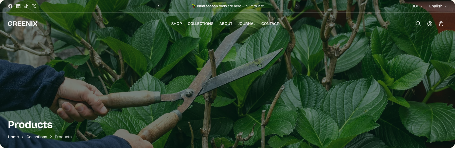
The heading fills itself in
Leave Heading blank and the hero uses the page's own title: the collection name on a collection, the post title on an article, the page title on a page.
That is almost always what you want. It means a new collection gets a correct hero the moment it is created, with nothing to set. Type a heading only when you need this one page to say something different from its title.
On templates with no natural title — search, cart, 404 — the theme supplies a sensible one.
Background media
The hero picks its background in a fixed order, using the first thing it finds:
- The collection's own image — on collection pages only
- Video set on this section
- Image set on this section
- The first product's image — on collection pages only
- Background color
This is why a collection page can look right without you touching the section: give the collection an image in the admin and the hero uses it. The section's own image is the fallback for every other template.
Setting a collection image beats setting a section image
On a collection template, the collection's image wins over anything set on the section — including a video. One page hero then serves every collection, each showing its own artwork, instead of you creating a template per collection.
If a collection has no image of its own, the hero borrows the first product's photo rather than dropping to a flat color. It keeps the page from looking unfinished, but it changes whenever the collection is reordered, so set a proper collection image once you have one.
Overlay and text
Text sits over the background, so it needs help staying readable.
Overlay opacity darkens the media behind the text. Hero overlay background color sets what it darkens with — leave it blank and it uses the color scheme's heading color rather than plain black, which keeps the tint in family with the rest of the store.
Text color defaults to white, which suits a darkened image. If you are using a pale background color rather than a photo, set it to something with contrast.
Other settings
Show collection description pulls in the collection's description beneath the heading. It only does anything on collection pages, since no other template has one.
Show breadcrumb adds the trail back up the hierarchy — Home › Collections › Hand tools. Worth leaving on: it helps customers who arrived from search rather than from your navigation.
Enable parallax effect makes the background drift as the page scrolls. It is off by default.
Section settings
Content
| Setting | Type | Default | Notes |
|---|---|---|---|
| Heading | Text | — | Leave blank to use page title automatically |
| Show collection description | Checkbox | Off | Only applies to collection pages. |
| Show breadcrumb | Checkbox | On | — |
Media
| Setting | Type | Default | Notes |
|---|---|---|---|
| Image | Image | — | — |
| Video | Video | — | Video will be used as background when video is set, otherwise image will be used |
| Background color | Color | — | Used as fallback when no image or video is set |
Full width settings
| Setting | Type | Default | Notes |
|---|---|---|---|
| Hero overlay background color | Color | — | — |
| Overlay opacity | Slider (0–90 %) | 55 | — |
| Text color | Color | #FFFFFF | — |
Parallax animation
| Setting | Type | Default | Notes |
|---|---|---|---|
| Enable parallax effect | Checkbox | Off | Enable parallax animation for the image or video |