
Appearance
Shoppable image
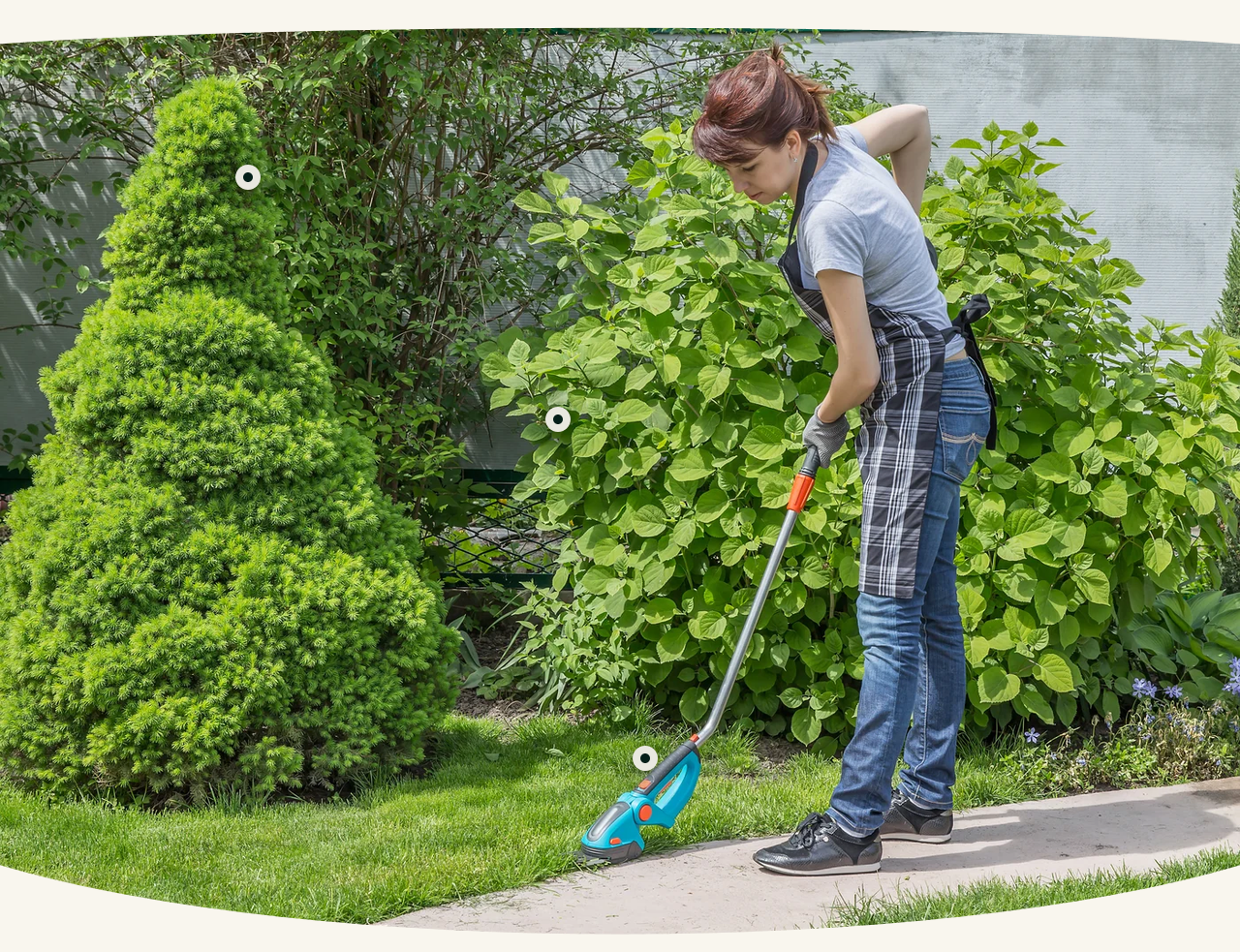
A photograph with products marked on it. The visitor taps a hotspot and a card appears with that product's name, price and a link.
It is how you sell a scene rather than an item — a workbench, a planted border, a finished job — where the appeal is the whole picture and the products are in it.
Setting it up
- Choose the Image.
- Add a Hotspot block for each product in the shot.
- In each hotspot, pick the Product and set its position.
Horizontal position and Vertical position are percentages across and down the image. Adjust them and watch the preview — it is quicker than calculating.
Card opens toward sets which way the product card appears. Change it for hotspots near an edge, where a card opening outward would be cut off.
Choosing the image
Wide and uncluttered works best. Every hotspot needs space around it, so a busy photograph leaves nowhere to put them.
Three to five hotspots is comfortable. More than that and they overlap on a phone, where the image is far narrower than the one you positioned them on.
Check it on a phone
Hotspot positions are percentages, so they follow the image as it scales — but what looked well-spaced on a wide desktop image can bunch together on a narrow one. Preview at phone width before publishing.
Section height
Section height offers preset heights, with Custom height for a specific value. Taller suits a portrait photograph; the presets suit landscape.
Curves
Show top and bottom curves adds a curved edge where this section meets the ones above and below.
Settings
Section settings
Image
| Setting | Type | Default | Notes |
|---|---|---|---|
| Image | Image | — | — |
| Section height | Dropdown | Custom height | Options: Adapt to image, Custom height |
| Custom height | Slider (300–2000 px) | 1000 | Only used when "Section height" is set to Custom. The image is cropped to fill.. Only shown with related settings enabled |
Curve edges
| Setting | Type | Default | Notes |
|---|---|---|---|
| Show top and bottom curves | Checkbox | On | — |
Background
| Setting | Type | Default | Notes |
|---|---|---|---|
| Background | Color | — | — |
Padding
| Setting | Type | Default | Notes |
|---|---|---|---|
| Padding top | Number | — | Adjust the top padding for this section. If left empty, the global section padding will be used by default. |
| Padding bottom | Number | — | Adjust the bottom padding for this section. If left empty, the global section padding will be used by default. |
Blocks
Hotspot
| Setting | Type | Default | Notes |
|---|---|---|---|
| Product | Product | — | — |
| Horizontal position | Slider (0–100 %) | 50 | — |
| Vertical position | Slider (0–100 %) | 50 | — |
| Card opens toward | Dropdown | Bottom right | Options: Bottom right, Bottom left, Top right, Top left |