
Appearance
Header
The header carries your logo, navigation, search, account and cart. It appears on every page, and it is the section customers interact with most, so it repays the time spent setting it up properly.
Find it in the theme editor under Header in the left sidebar.
Navigation
Navigation selects which menu appears. Menus are built in the admin under Content → Menus, not in the theme editor — the theme only chooses between the menus you have already created.
A menu with nested items becomes a dropdown automatically. Nest one level deeper and you get a second level of dropdown.
Navigation text case and Show dropdown chevron control presentation. Turning the chevron on makes it obvious which items open a dropdown, which is worth doing if only some of your top-level items have children.
Logo
Logo image and Logo width set the logo. Upload at roughly twice the width you intend to display, so it stays sharp on high-resolution screens.
Logo position places it left or centered. A centered logo pushes navigation to both sides, which suits a short menu and starts to crowd with a long one.
Height sets the header height. It is worth checking on a phone after changing — a tall header eats into the first screen, which is where your hero is trying to make its case.
Mega menu
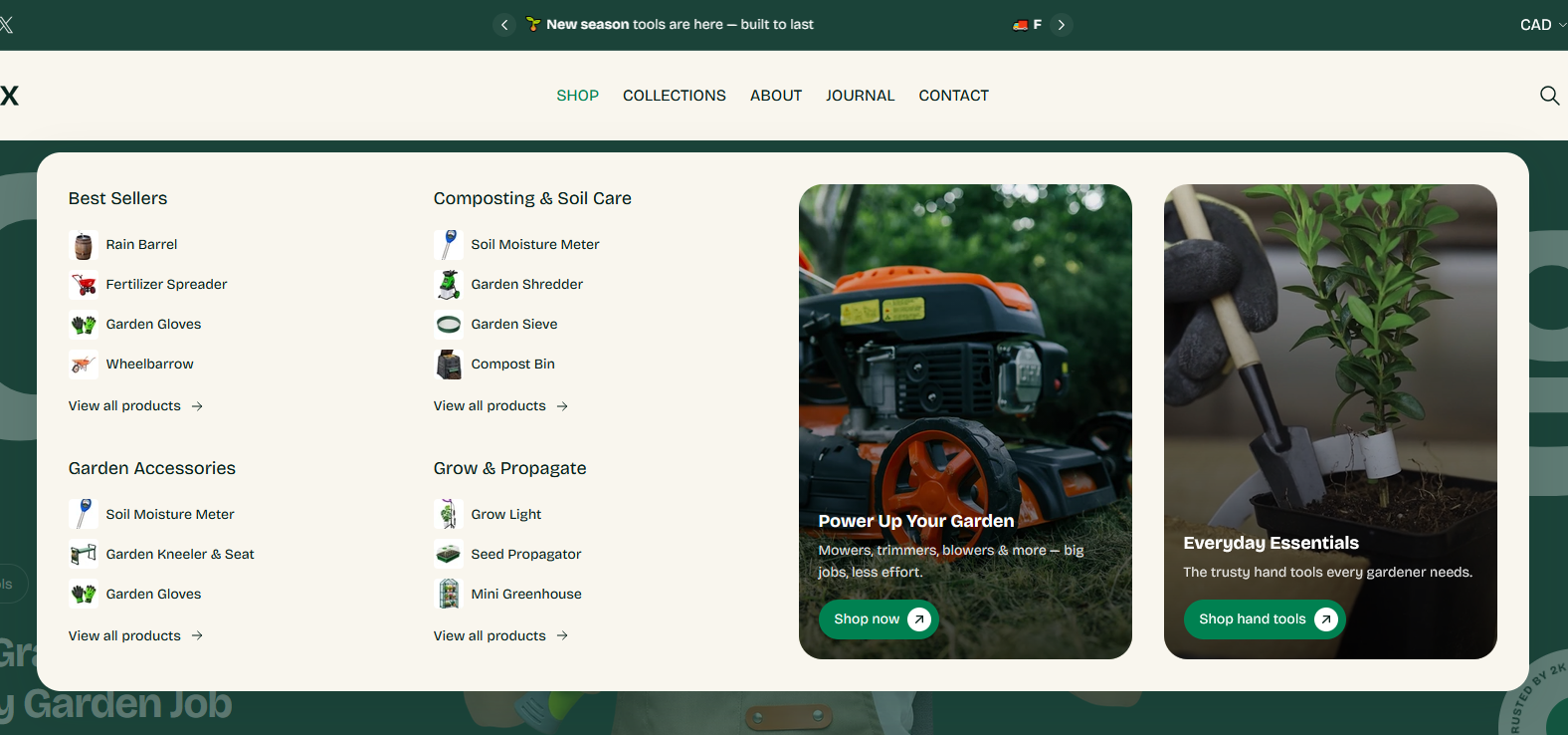
The Megamenu block turns one top-level menu item into a full-width panel with columns, images and promotional cards.
To set one up:
- Add a Megamenu block to the header.
- In Trigger link, type the top-level menu item it should open under. This must match the menu item's name exactly — if the menu says
Shop, typingshopwill not connect them. - Choose how many Link columns you want, then fill in each one.
Each column can hold a heading, a menu, a collection and an image. A column pointed at a collection shows its products, up to the Collection product limit, with Show product images deciding whether they appear as pictures or as a plain list.
The two Promo cards sit alongside the columns and take an image or a video, a heading, text and a button — the place for a seasonal campaign or a featured range.
Only worth it above a certain size
A mega menu earns its place when a customer would otherwise have to guess which of several similar categories to open. With five or six top-level items and a shallow catalog, a plain dropdown is faster to use and far less to maintain.
Search and account
Show search adds the search icon, which opens the Search drawer.
The account icon appears whenever customer accounts are turned on in your Shopify admin, and hides itself when they are not — there is no theme setting for it. The links inside the account panel come from Shopify's own customer account menu, which you edit under Content → Menus.
Cart
The cart icon comes from theme settings, where you also choose whether clicking it opens the cart drawer or goes to the cart page.
Sticky behavior
The header becomes fixed once the customer scrolls past a short distance, and releases when they scroll back to the top. There is no setting for this — it is how the header behaves.
Section settings
Layout
| Setting | Type | Default | Notes |
|---|---|---|---|
| Navigation | Menu | main-menu | — |
| Navigation text case | Dropdown | UPPERCASE | Options: Default, UPPERCASE, lowercase, Capitalize |
| Logo position | Dropdown | Left | Options: Center, Left |
| Show dropdown chevron | Checkbox | Off | — |
| Height | Slider (50–130 px) | 90 | — |
Logo
| Setting | Type | Default | Notes |
|---|---|---|---|
| Logo image | Image | — | — |
| Logo width | Slider (50–150 px) | 120 | — |
Search
| Setting | Type | Default | Notes |
|---|---|---|---|
| Show search | Checkbox | On | — |
Blocks
Megamenu
| Setting | Type | Default | Notes |
|---|---|---|---|
| Trigger link | Text | — | Enter the exact nav link title to attach this megamenu. |
| Link columns | Slider (2–4) | 4 | Number of link columns shown on the left. |
Collection settings
| Setting | Type | Default | Notes |
|---|---|---|---|
| Collection product limit | Slider (3–10) | 4 | Maximum products shown per collection column. |
| Show product images | Checkbox | On | — |
Column 1
| Setting | Type | Default | Notes |
|---|---|---|---|
| Column heading | Text | — | Leave blank to use the collection title. |
| Collection | Collection | — | — |
| Links | Menu | main-menu | — |
| Column image | Image | — | — |
Column 2
| Setting | Type | Default | Notes |
|---|---|---|---|
| Column heading | Text | — | Leave blank to use the collection title. |
| Collection | Collection | — | — |
| Links | Menu | main-menu | — |
| Column image | Image | — | — |
Column 3
| Setting | Type | Default | Notes |
|---|---|---|---|
| Column heading | Text | — | Leave blank to use the collection title. |
| Collection | Collection | — | — |
| Links | Menu | main-menu | — |
| Column image | Image | — | — |
Column 4
| Setting | Type | Default | Notes |
|---|---|---|---|
| Column heading | Text | — | Leave blank to use the collection title. |
| Collection | Collection | — | — |
| Links | Menu | main-menu | — |
| Column image | Image | — | — |
Promo card 1
| Setting | Type | Default | Notes |
|---|---|---|---|
| Image | Image | — | — |
| Video | Video | — | Replaces the image when set. |
| Heading | Text | — | — |
| Text | Text | — | — |
| Button label | Text | — | — |
| Link | Link | — | — |
Promo card 2
| Setting | Type | Default | Notes |
|---|---|---|---|
| Image | Image | — | — |
| Video | Video | — | Replaces the image when set. |
| Heading | Text | — | — |
| Text | Text | — | — |
| Button label | Text | — | — |
| Link | Link | — | — |