
Appearance
Trusted brands
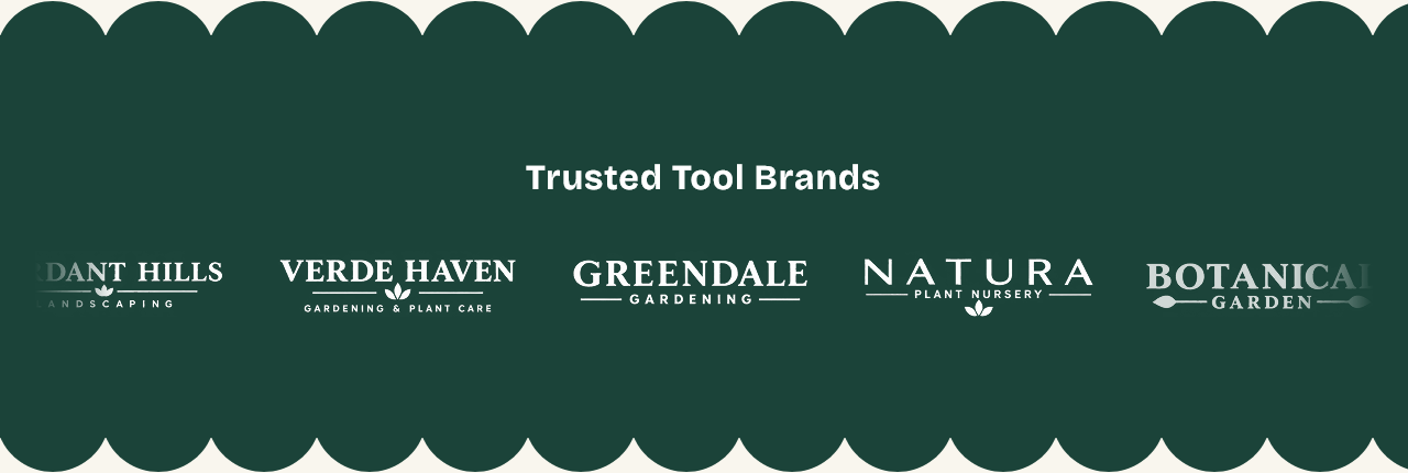
A scrolling row of logos — the brands you stock, the certifications you hold, the publications that covered you.
Setting it up
Heading is optional. Add a Logo block per image.
Logo height and Gap between logos set the spacing. Scroll duration sets how fast the row moves; a longer duration is slower.
Pause on hover stops the scroll while the cursor is over it, so someone can read a logo they recognised. It does nothing on touch devices, which have no hover.
Logo color filter
Logo color filter unifies logos that arrive in different colors — turning them all to one tone so the row reads as a set rather than as a collage.
Worth using. Brand logos come in whatever colors their owners chose, and a row of them at full strength competes with everything else on the page.
Preparing the images
Transparent PNG or SVG. A logo on a white background shows as a white rectangle on any section that is not also white.
Logos vary enormously in proportion — some are wide wordmarks, some are square marks. The height setting equalises them vertically, but a very wide logo still takes far more room than a compact one. Trimming the empty space around each image before uploading helps more than any setting.
Scalloped edges
Show scalloped edges gives the band wavy edges, with Bump size setting how pronounced they are — the same treatment as Values band.
A note on permission
Only show logos you are entitled to show. Stocking a brand usually allows it; some brands have guidelines about how their mark may be displayed, and a few require you to ask.
Settings
Section settings
Content
| Setting | Type | Default | Notes |
|---|---|---|---|
| Heading | Text | Trusted Tool Brands | — |
Logos
| Setting | Type | Default | Notes |
|---|---|---|---|
| Logo height | Slider (20–80 px) | 60 | — |
| Gap between logos | Slider (24–120 px) | 48 | — |
| Logo color filter | Dropdown | Original | Options: Original, Grayscale, Grayscale muted |
| Scroll duration | Slider (10–80 s) | 35 | — |
| Pause on hover | Checkbox | On | — |
Scalloped edges
| Setting | Type | Default | Notes |
|---|---|---|---|
| Show scalloped edges | Checkbox | On | — |
| Bump size | Slider (12–60 px) | 32 | — |
Background
| Setting | Type | Default | Notes |
|---|---|---|---|
| Background | Color | — | — |
Padding
| Setting | Type | Default | Notes |
|---|---|---|---|
| Padding top | Number | — | Adjust the top padding for this section. If left empty, the global section padding will be used by default. |
| Padding bottom | Number | — | Adjust the bottom padding for this section. If left empty, the global section padding will be used by default. |
Blocks
Logo
| Setting | Type | Default | Notes |
|---|---|---|---|
| Logo image | Image | — | — |
| Brand name (text fallback) | Text | BRAND | Shown if no image is uploaded. |
| Link | Link | — | — |