
Appearance
Hero
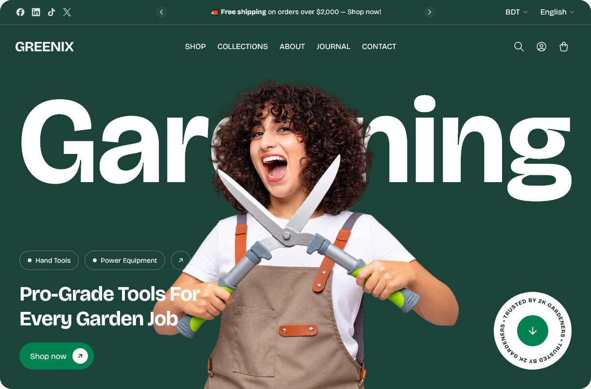
The opening section of the home page. A cut-out product image sits over a large background word, with a heading, category chips and a call to action.
Setting it up
Foreground image is the product photograph. It works best as a cut-out — a product with its background removed, saved as a PNG with transparency — because it sits over the background word rather than in a box.
Background text is the oversized word behind it. It scales to fill the width, so a short word renders large and a long one renders smaller rather than wrapping. One or two words is the intent.
Minimum height (desktop) sets how much of the first screen the hero claims.
Category chips
Add Category chip blocks for the small links along the bottom. They are quick routes into your main collections for a visitor who already knows what they want.
Chips arrow link adds an arrow at the end of the row pointing at a fuller listing — your collections page, usually.
Four or five chips is plenty. Past that they wrap and stop reading as a row.
Rotating badge
Show rotating badge adds a circular badge with text that turns slowly. Badge text sets the wording — a guarantee, a shipping promise, a season.
Keep it to a few words. The text runs around a circle, so a sentence becomes unreadable.
This is the LCP
On the home page, the hero image is almost always the largest thing the visitor loads, and how quickly it appears is what page speed tools measure.
Export the foreground image at roughly the size it will be displayed rather than at full camera resolution. A 4000-pixel PNG in a 900-pixel slot costs the visitor the whole file for no visible gain, and PNG is already the heavier format — worth it for transparency, not worth it at that size.
Settings
Section settings
Layout and background
| Setting | Type | Default | Notes |
|---|---|---|---|
| Minimum height (desktop) | Slider (500–900 px) | 750 | — |
| Background | Color | — | — |
Background text
| Setting | Type | Default | Notes |
|---|---|---|---|
| Background text | Text | Gardening | Large decorative word shown behind the image. |
Image
| Setting | Type | Default | Notes |
|---|---|---|---|
| Foreground image | Image | — | A cut-out subject on a transparent background (.png) works best. |
Content
| Setting | Type | Default | Notes |
|---|---|---|---|
| Heading | Text | Pro-Grade Tools For Every Garden Job | — |
| Chips arrow link | Link | — | Small circular arrow shown next to the category chips. |
Button
| Setting | Type | Default | Notes |
|---|---|---|---|
| Button label | Text | Shop now | — |
| Button link | Link | — | — |
| Button style | Dropdown | Primary | Options: Primary, Secondary |
Rotating badge
| Setting | Type | Default | Notes |
|---|---|---|---|
| Show rotating badge | Checkbox | On | — |
| Badge text | Text | Trusted by 10k gardeners | Repeated around the circle. |
| Badge link | Link | — | Leave blank to make the badge scroll down to a section instead. |
| Scroll target | Text | — | CSS selector of the section to scroll to when the badge is clicked (e.g. #shopify-section-product_tabs). Used only when Badge link is blank. Leave blank to scroll to the next section. |
Blocks
Category chip
| Setting | Type | Default | Notes |
|---|---|---|---|
| Label | Text | Hand Tools | — |
| Link | Link | — | — |