
Appearance
Image with text banner
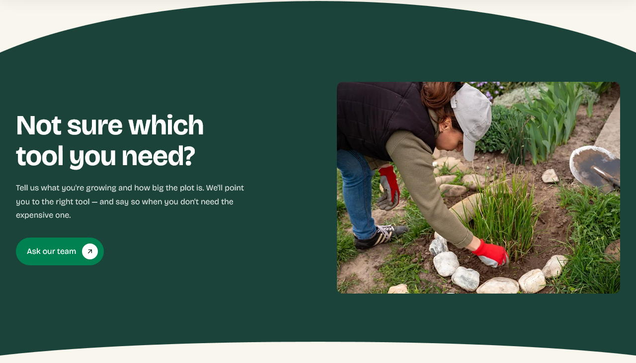
An image beside a heading, some text and a button. The general-purpose banner — use it whenever you need to make one point with one picture.
Setting it up
Image, Heading, Description, Button label and Button link. There is nothing else to decide.
That is the section's value. When a page needs a break between heavier sections, or a campaign needs somewhere to live for a fortnight, this is the one that takes five minutes.
Curves
Show top and bottom curves curves the edges where this section meets its neighbors.
Curves show only where two different background colors meet, so if this section and the one above share a background, turning them on changes nothing visible.
Using more than one
You can add several to a page, and they will look consistent. Alternate what each one does — one pointing at a collection, one at a guide, one at your story — rather than three variations on the same message.
Settings
Section settings
Content
| Setting | Type | Default | Notes |
|---|---|---|---|
| Heading | Text | Not sure which tool you need? | — |
| Description | Multi-line text | Tell us what you're growing and how big the plot is. We'l… | — |
Button
| Setting | Type | Default | Notes |
|---|---|---|---|
| Button label | Text | Ask our team | — |
| Button link | Link | — | — |
Image
| Setting | Type | Default | Notes |
|---|---|---|---|
| Image | Image | — | — |
Decoration
| Setting | Type | Default | Notes |
|---|---|---|---|
| Show top and bottom curves | Checkbox | On | — |
Background
| Setting | Type | Default | Notes |
|---|---|---|---|
| Background | Color | — | — |
Padding
| Setting | Type | Default | Notes |
|---|---|---|---|
| Padding top | Number | — | Adjust the top padding for this section. If left empty, the global section padding will be used by default. |
| Padding bottom | Number | — | Adjust the bottom padding for this section. If left empty, the global section padding will be used by default. |