
Appearance
Featured collections
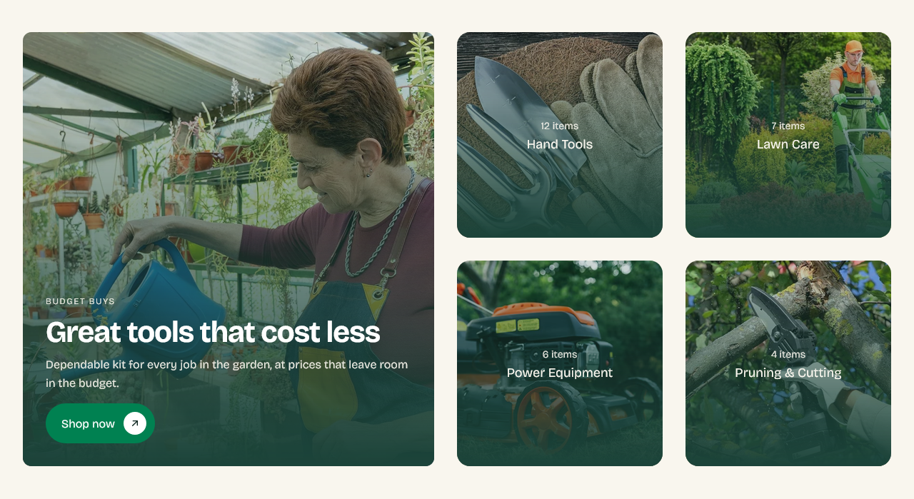
A curated set of collection cards — the main routes into your catalog, chosen by hand rather than listing everything.
Setting it up
The section has a large lead collection and a row of smaller cards beside it.
Collection sets the lead one. Add Collection card blocks for the rest, each pointing at its own collection.
Image override
Each card takes its collection image automatically. Image override replaces it for that card only.
Useful when a collection's image works on a collection page but not here — where the card is a different shape, or where the row needs images that share a look. Overriding here does not change the collection.
Overlay opacity
The collection name sits over the image, so it needs the image darkened behind it. Overlay opacity controls how much.
Photographs vary a lot in how much they need. Check the palest image in the row rather than the darkest — that is the one where the text disappears.
Choosing what to feature
Three or four collections. This section is a decision aid, not a directory: the point is to answer "where do I start" for someone who has just arrived.
For a full list of everything, link to the collections list page instead.
Settings
Section settings
Featured card (left)
| Setting | Type | Default | Notes |
|---|---|---|---|
| Collection | Collection | — | — |
| Image override | Image | — | Optional. Falls back to the collection image. |
| Subheading | Text | Featured collection | — |
| Heading | Text | Our pick of the season | — |
| Description | Multi-line text | A hand-picked selection, chosen for the jobs that come ro… | — |
| Button label | Text | Shop now | — |
| Button link | Link | — | Leave blank to link to the featured collection. |
Overlay
| Setting | Type | Default | Notes |
|---|---|---|---|
| Overlay opacity | Slider (0–100 %) | 100 | — |
Background
| Setting | Type | Default | Notes |
|---|---|---|---|
| Background | Color | — | — |
Padding
| Setting | Type | Default | Notes |
|---|---|---|---|
| Padding top | Number | — | Adjust the top padding for this section. If left empty, the global section padding will be used by default. |
| Padding bottom | Number | — | Adjust the bottom padding for this section. If left empty, the global section padding will be used by default. |
Blocks
Collection card
| Setting | Type | Default | Notes |
|---|---|---|---|
| Collection | Collection | — | — |
| Custom title | Text | — | Overrides the collection title. |
| Custom image | Image | — | Overrides the collection image. |
| Show product count | Checkbox | On | — |