
Appearance
Buttons
Shape, size and behavior for every button in the store — add to cart, checkout, section call-to-actions and the rest. Button colors are not here; they come from the color scheme in use, so a button automatically suits whatever section it sits in.
Open Theme settings → Buttons in the theme editor.
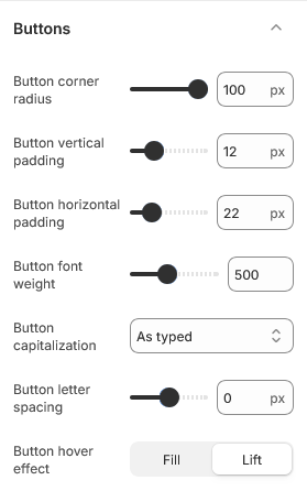
Shape and size
Button corner radius runs from square to fully rounded. At the maximum the button becomes a pill, which is how Greenix ships.
Button vertical padding and Button horizontal padding set the space inside the button, which is what actually determines its size — there is no height setting, because a button has to grow with its label. Horizontal padding is worth more than vertical for making a button feel substantial.
Keep buttons tappable
Vertical padding below about 10 leaves buttons under the size that is comfortable to tap on a phone. If you want a slimmer look, reduce the font weight before reducing the padding.
Text
Button font weight and Button letter spacing apply to the label.
Button capitalization switches labels to uppercase or leaves them as typed. Uppercase suits short labels; on a long label such as "Add to cart and continue shopping" it gets hard to read.
Hover effect
Button hover effect sets what happens when a cursor is over a button. Whichever you pick, it has no effect on touch devices, where there is no hover state — the button simply responds to the tap.
| Setting | Type | Default | Notes |
|---|---|---|---|
| Button corner radius | Slider (0–100 px) | 100 | — |
| Button vertical padding | Slider (6–30 px) | 12 | — |
| Button horizontal padding | Slider (12–60 px) | 22 | — |
| Button font weight | Slider (300–800) | 500 | — |
| Button capitalization | Dropdown | As typed | Options: As typed, Uppercase, Lowercase, Capitalize |
| Button letter spacing | Slider (-10–10 px) | 0 | — |
| Button hover effect | Dropdown | Lift | Options: Fill, Lift |