
Appearance
Collection cards
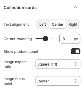
The tile that represents a collection — on the collections list page and in any section that shows collections, such as Featured collections.
Open Theme settings → Collection cards in the theme editor.
Where the image comes from
A collection card shows the collection's own image. If a collection has none, the theme falls back to the featured image of the first product in it, so a card is never blank while you are still setting collections up.
Set a collection image under Products → Collections → Collection image in the admin. Relying on the fallback long-term is not ideal: the card then changes whenever the collection is reordered.
Shape and cropping
Image aspect ratio sets the shape of every card, which is what keeps a row of collections aligned regardless of the images behind them.
Image focus point decides which part of the image survives the crop. As with product cards, a focal point set on the image itself in Shopify takes priority, so you can correct a single awkward image without changing the setting for all of them.
Corner rounding rounds the card.
Content
Text alignment positions the collection title on the card.
Show product count adds the number of products in the collection. It is accurate and updates itself, which makes it useful on a store with deep collections and slightly awkward on one where a collection holds two items.
| Setting | Type | Default | Notes |
|---|---|---|---|
| Text alignment | Dropdown | Center | Options: Left, Center, Right |
| Corner rounding | Slider (0–40 px) | 18 | — |
| Show product count | Checkbox | On | — |
| Image aspect ratio | Dropdown | Square (1:1) | Options: Circle, Square (1:1), Portrait (3:4), Landscape (4:3), Adapt to image |
| Image focus point | Dropdown | Center | Options: Center, Top, Bottom |