
Appearance
Contact
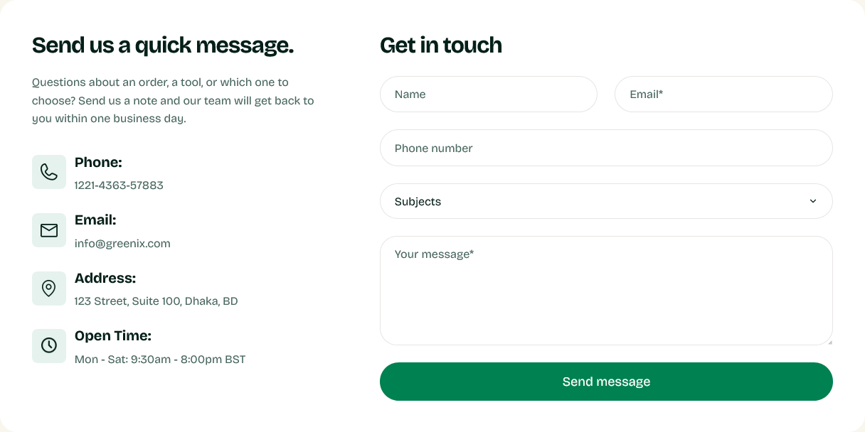
A working contact form beside your contact details.
Setting it up
Heading and Description sit above. Form heading labels the form itself, and Button label sets the submit button.
Add Contact info blocks for your details — each takes an Icon image and Text. Use them for the address, phone number, email and opening hours.
Building the form
The form's fields are blocks. Add a Form field block per field and choose its Field type.
Ask for as little as you can. Every field is a reason to give up, and most enquiries need only a name, an email address and a message. Add an order number field if you handle a lot of order queries; think twice about anything else.
Where submissions go
To the address set under Settings → Store details → Sender email in the admin — not to anything configured in the theme.
Check that address is one somebody reads before publishing the page. A contact form delivering to an unmonitored inbox is worse than no form, because the customer believes they have been in touch.
The dedicated contact template
Greenix ships a page.contact template built around this section. Create a page under Content → Pages and set its Theme template to contact.
Pair it with Contact map if you have premises worth visiting.
Settings
Section settings
Contact info
| Setting | Type | Default | Notes |
|---|---|---|---|
| Heading | Text | Send us a quick message. | — |
| Description | Multi-line text | Questions about an order, a tool, or which one to choose?… | — |
Form
| Setting | Type | Default | Notes |
|---|---|---|---|
| Form heading | Text | Get in touch | — |
| Button label | Text | Send message | — |
Background
| Setting | Type | Default | Notes |
|---|---|---|---|
| Background | Color | — | — |
| Card background | Color | — | Background of the panel holding the contact details and form. Defaults to white. |
Padding
| Setting | Type | Default | Notes |
|---|---|---|---|
| Padding top | Number | — | Adjust the top padding for this section. If left empty, the global section padding will be used by default. |
| Padding bottom | Number | — | Adjust the bottom padding for this section. If left empty, the global section padding will be used by default. |
Blocks
Contact info
| Setting | Type | Default | Notes |
|---|---|---|---|
| Icon image | Image | — | 24 x 24px recommended |
| Heading | Text | Phone: | — |
| Text | Multi-line text | +1 (555) 010-0000 | — |
Form field
| Setting | Type | Default | Notes |
|---|---|---|---|
| Field type | Dropdown | Text | Options: Text, Email, Phone, Number, Textarea (message), Select (dropdown) |
| Field name | Text | name | Used as contact[name]. e.g. name, email, phone, number, subject, body |
| Placeholder / default option | Text | Your name | Also used as the field's accessible label, since the design has no visible labels. |
| Dropdown options (comma separated) | Multi-line text | General Inquiry, Support, Sales, Other | Only used when Field Type is Select. Separate options with commas.. Only shown with related settings enabled |
| Required | Checkbox | Off | Adds an asterisk to the placeholder and blocks submission when empty. |
| Half width (side by side) | Checkbox | Off | — |