
Appearance
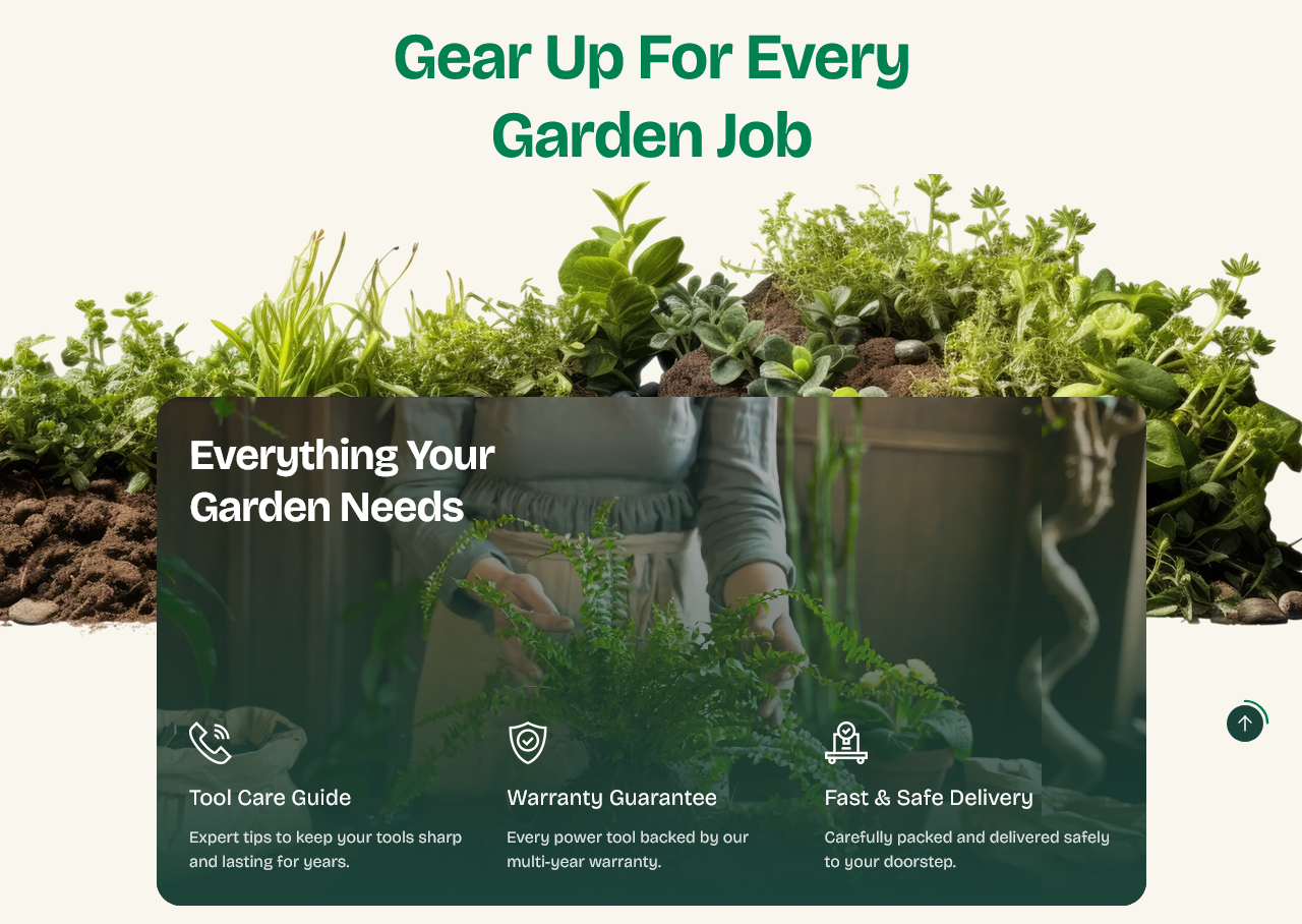
Feature callout
A row of cards, each with an image or video and a heading — the two or three reasons to buy here rather than elsewhere.
Setting it up
Section heading sits above the row. Add a Feature block per card.
Each card takes a Card heading, a Card image or Card video, a Card background and an Overlay opacity to keep the heading readable over the media.
Card minimum height applies to all of them, so the row stays even whatever the images.
Card overlap
Card overlap pulls the cards up so they sit over the section above.
It is a deliberate effect and needs the section above to have room for it — try it, look at the join, and turn it off if the two sections fight.
Decorative image
Decorative image is an optional flourish behind the row. Leave it empty for a plainer look.
Writing the cards
Three cards. Two feels thin, four starts to shrink on desktop and stacks into a long column on a phone.
Each heading should be a promise you can keep — "Next-day dispatch", "Two-year guarantee", "Repairs in-house". Vague ones such as "Great service" cost the same space and say nothing.
Settings
Section settings
Content
| Setting | Type | Default | Notes |
|---|---|---|---|
| Section heading | Text | Gear Up For Every Garden Job | Shown above the card in the accent color. |
Decoration
| Setting | Type | Default | Notes |
|---|---|---|---|
| Decorative image | Image | — | Optional band shown behind the top of the card. |
| Card overlap | Slider (0–240 px) | 240 | — |
Card
| Setting | Type | Default | Notes |
|---|---|---|---|
| Card heading | Text | Everything Your Garden Needs | — |
| Card background | Dropdown | Image | Options: Image, Video |
| Card image | Image | — | — |
| Card video | Video | — | — |
| Overlay opacity | Slider (0–100 %) | 100 | — |
| Card minimum height | Slider (320–720 px) | 500 | — |
Background
| Setting | Type | Default | Notes |
|---|---|---|---|
| Background | Color | — | — |
Padding
| Setting | Type | Default | Notes |
|---|---|---|---|
| Padding top | Number | 0 | Adjust the top padding for this section. If left empty, the global section padding will be used by default. |
| Padding bottom | Number | — | Adjust the bottom padding for this section. If left empty, the global section padding will be used by default. |
Blocks
Feature
| Setting | Type | Default | Notes |
|---|---|---|---|
| Icon | Image | — | — |
| Heading | Text | Feature | — |
| Description | Multi-line text | Short supporting description for this feature. | — |