
Appearance
Quality showcase
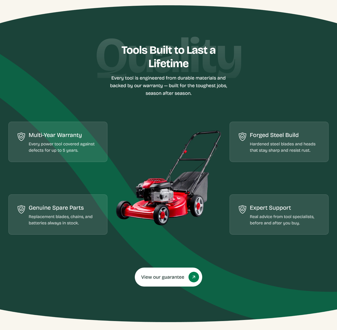
A centered product image surrounded by feature points, over a large background word. The considered pitch — where you explain why what you sell is worth its price.
Setting it up
Center image is the product. As with the Hero, a cut-out on transparency works best, since it sits over the background rather than in a frame.
Background text is the oversized word behind it, scaling to fill the width.
Heading and Subheading carry the argument, and Button label and Button link send the reader on.
Feature blocks
Add a Feature block per point. They arrange themselves around the image.
Four to six is the range this layout is built for. Fewer leaves the arrangement looking sparse; more crowds the image it is meant to be pointing at.
Write each as a claim, not a category. "Forged steel, not cast" says more than "Materials".
Decoration
Show decorative ribbon adds a ribbon behind the image.
Show top and bottom curves curves the edges where this section meets its neighbors. Curves look best used occasionally — on every section in a row they stop reading as a flourish.
Settings
Section settings
Content
| Setting | Type | Default | Notes |
|---|---|---|---|
| Background text | Text | Quality | Large faded word shown behind the heading. |
| Heading | Text | Tools Built to Last a Lifetime | — |
| Subheading | Multi-line text | Every tool is engineered from durable materials and backe… | — |
Image
| Setting | Type | Default | Notes |
|---|---|---|---|
| Center image | Image | — | — |
Decoration
| Setting | Type | Default | Notes |
|---|---|---|---|
| Show decorative ribbon | Checkbox | On | — |
| Show top and bottom curves | Checkbox | On | — |
Button
| Setting | Type | Default | Notes |
|---|---|---|---|
| Button label | Text | View our guarantee | — |
| Button link | Link | — | — |
Background
| Setting | Type | Default | Notes |
|---|---|---|---|
| Background | Color | — | — |
Padding
| Setting | Type | Default | Notes |
|---|---|---|---|
| Padding top | Number | — | Adjust the top padding for this section. If left empty, the global section padding will be used by default. |
| Padding bottom | Number | — | Adjust the bottom padding for this section. If left empty, the global section padding will be used by default. |
Blocks
Feature
| Setting | Type | Default | Notes |
|---|---|---|---|
| Icon | Image | — | — |
| Heading | Text | Feature | — |
| Description | Multi-line text | Short supporting description for this feature. | — |